Close


Photo:
Walmart
Earlier this month, Walmart revealed some new branding, which the company says better represents the retailer in today’s market and matches the changing needs of its customers.
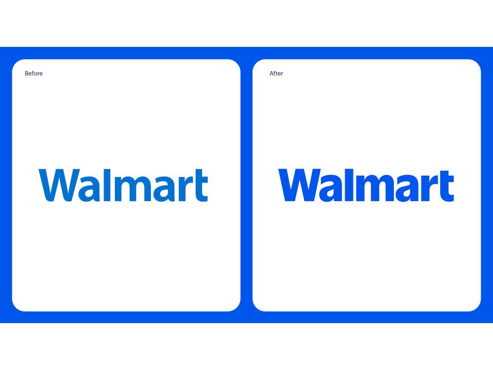
The latest design features a wordmark (the Walmart name logo) inspired by founder Sam Walton’s trucker hat, according to the company. It also has a more contemporary custom font to help “differentiate Walmart from the crowd.”

Walmart
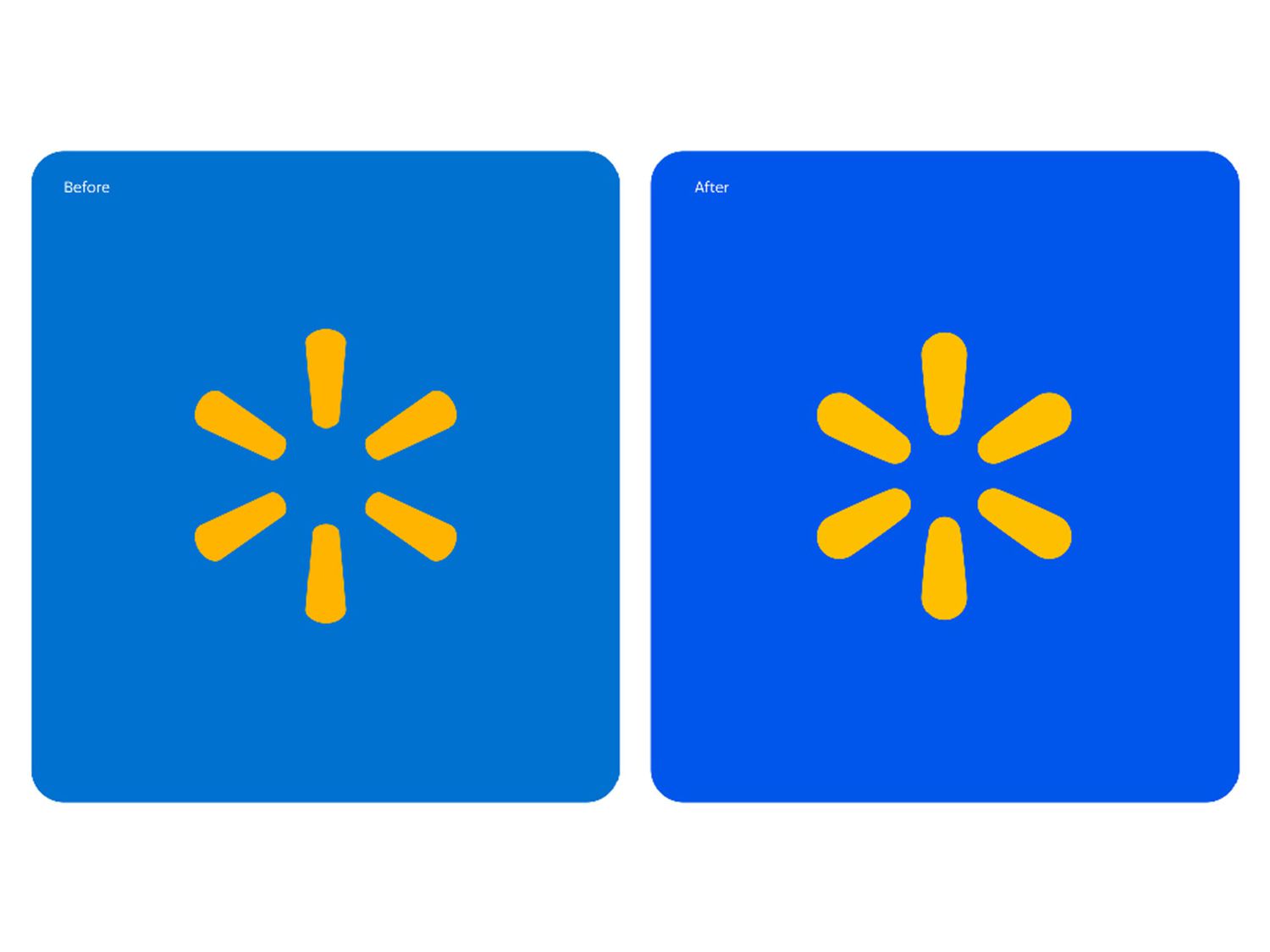
The colors, now True Blue and Spark Yellow, stay true to the “retailer’s most recognizable tones.” Meanwhile, the iconic yellow spark image “remains a beacon that guides customers through all facets of the Walmart experience.”
William White, Senior Vice President and Chief Marketing Officer of Walmart U.S., said in a press release that the “refreshed brand identity reflects Walmart’s enduring commitment to both Sam’s principles and serving our customers however they need us.” He also notes that it’s important for the brand to evolve with the customers.
The Springdale, Ark., location was the first Walmart store to receive the brand refresh back in October. More stores, along with the retailer's website and app, continued rolling out the new look this month. The remaining stores will make the switch later this year.

Walmart
What Fans Are Saying About Walmart’s Latest Look
While Walmart hopes this rebrand will help “build credibility and connection” and “be seen as a more modern, culturally dynamic brand,” not all customers are on board.
One Redditor didn’t see enough difference for Walmart to call it a rebrand when they “just made the blue a couple shades darker with slightly thicker font.” Others had similar thoughts about the upgrade: “It kind of just looks like they put new ink in the printer [and] got rid of the old faded cartridge.” Others couldn’t help but point out the alleged cost of more than $1 million for the rebrand, saying it looked like “something I can do on my home computer.”
However, in another thread, some argued that the subtle difference was an improvement: “I always thought Walmart’s old shade of blue was a bit obnoxious,” one Redditor said. “This darker one feels much more welcoming.”
Was this page helpful?
Thanks for your feedback!
Tell us why!
Other
Submit

